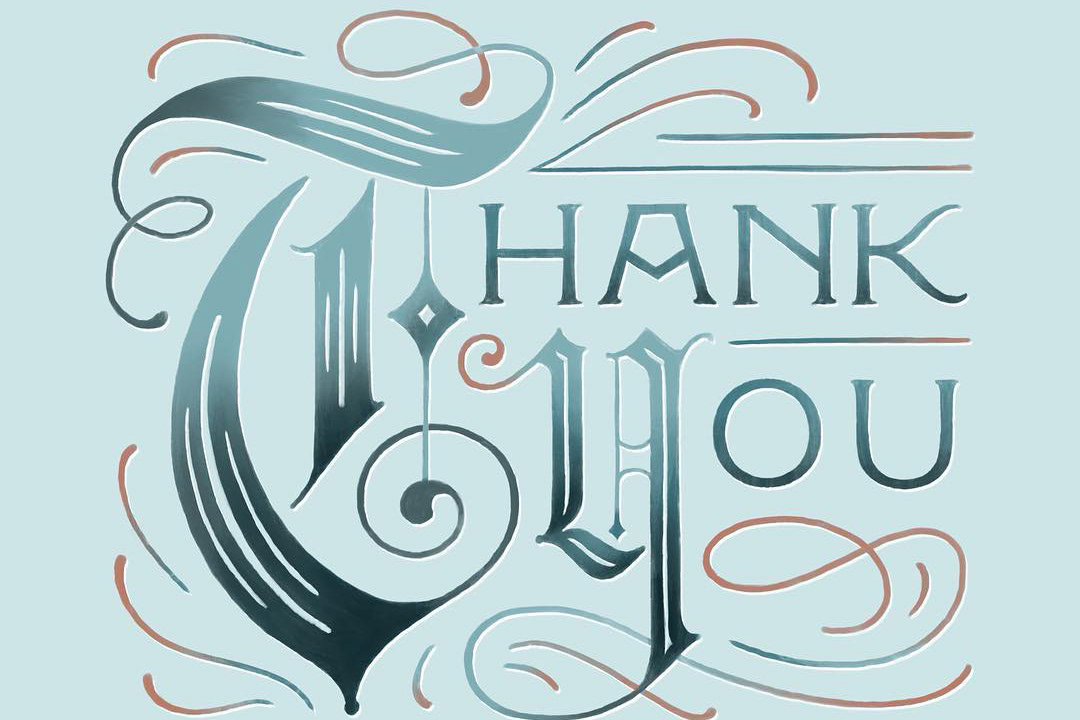
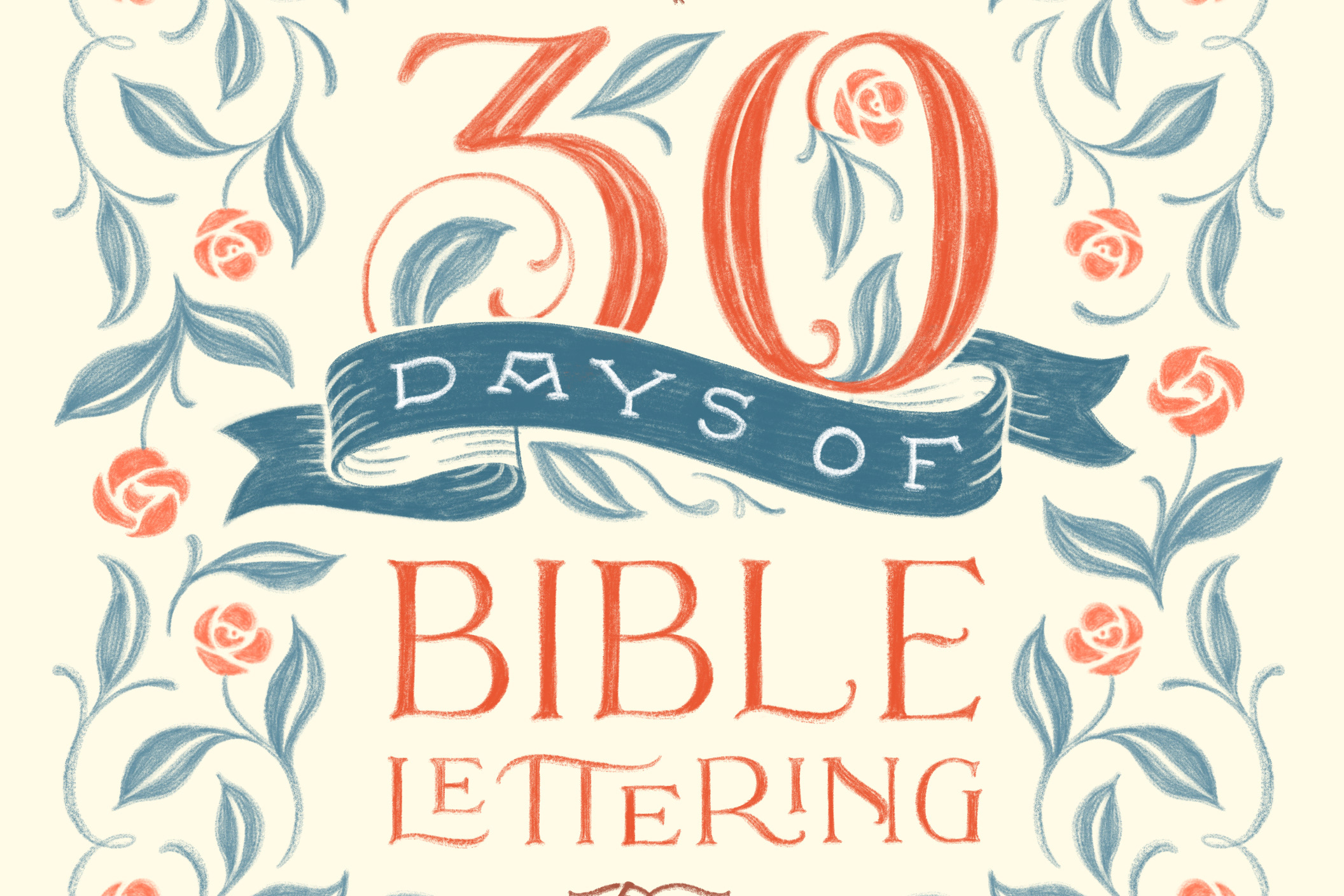
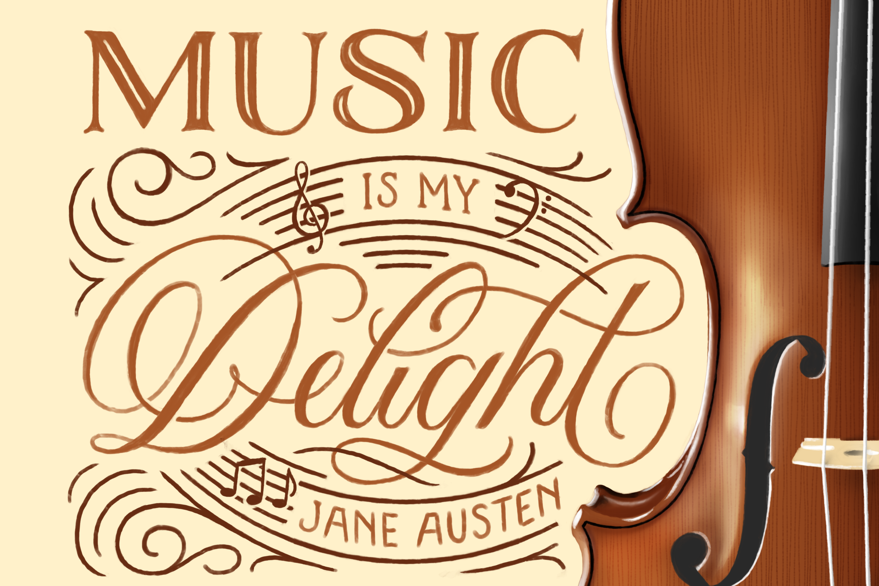
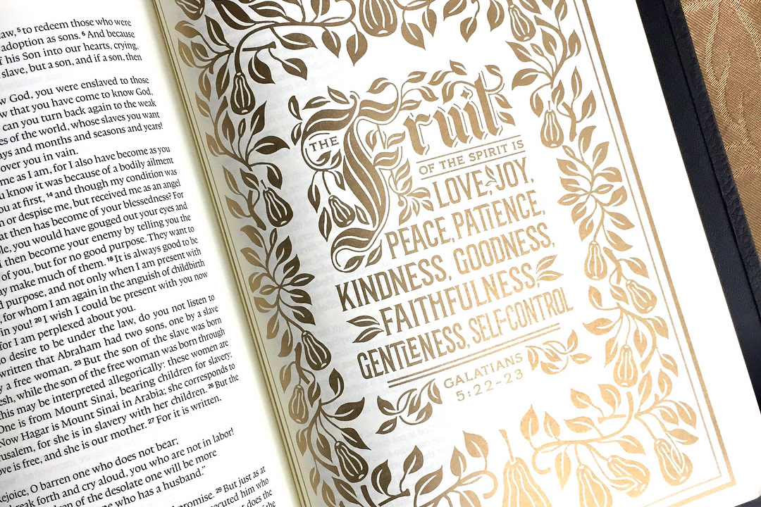
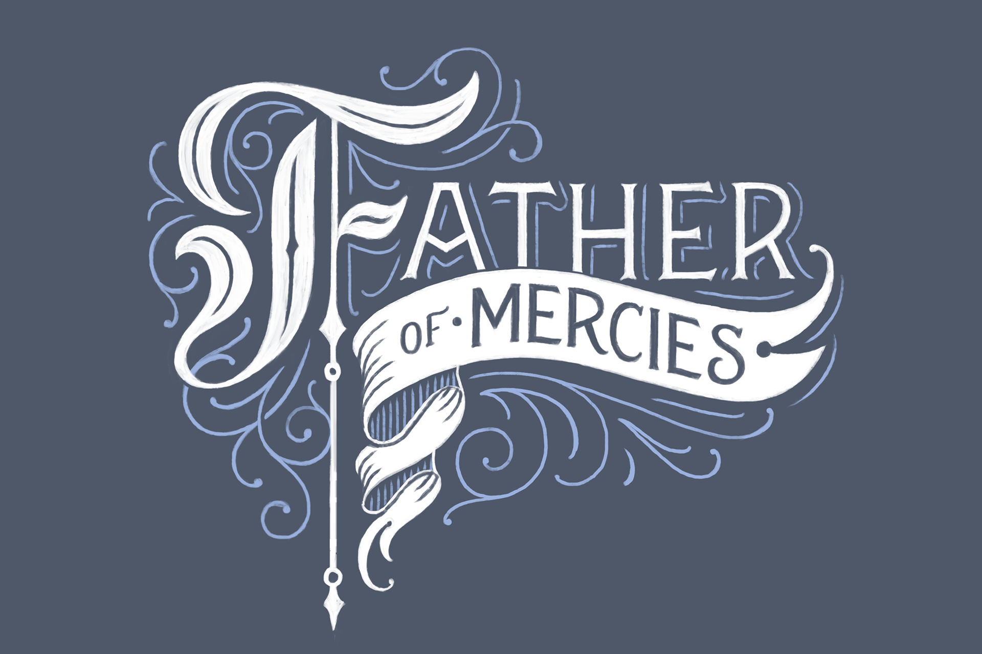
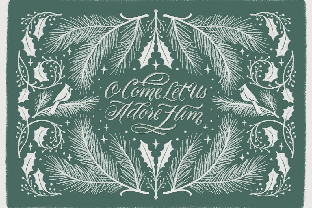
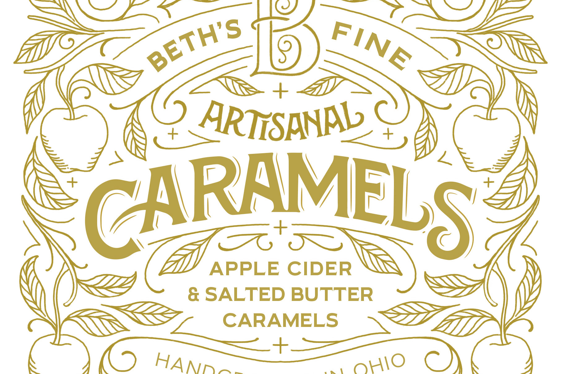
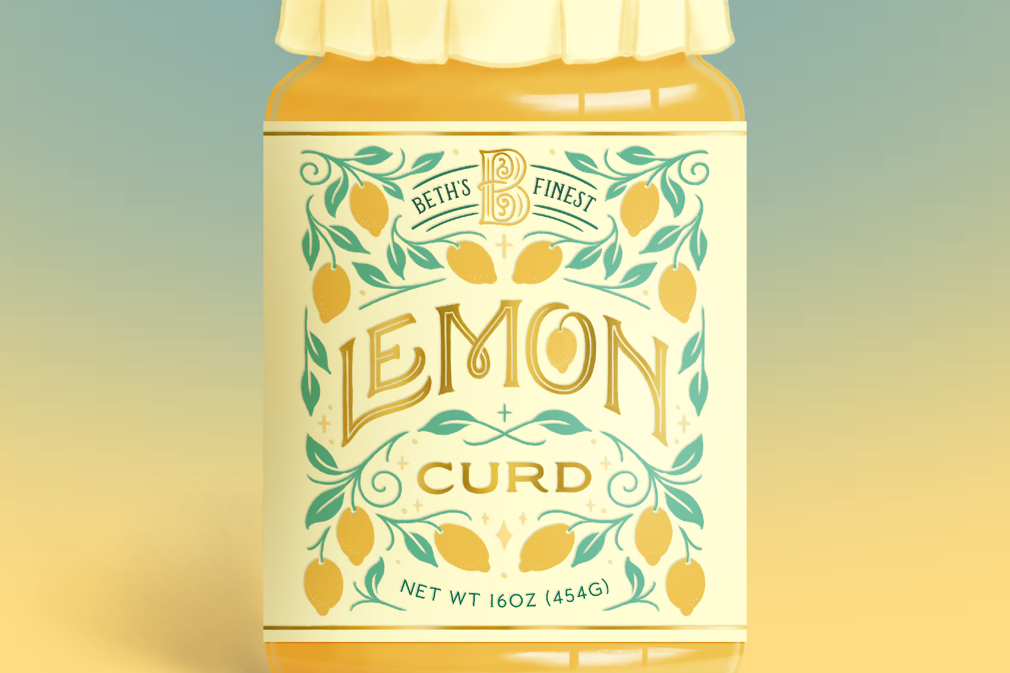
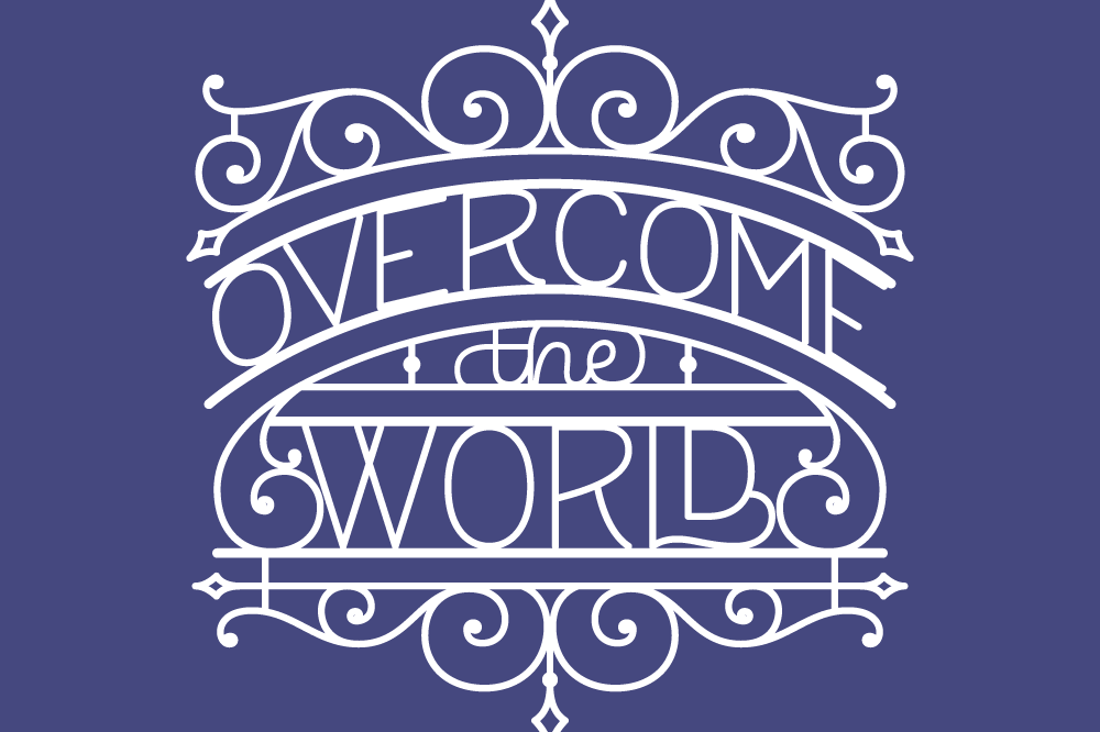
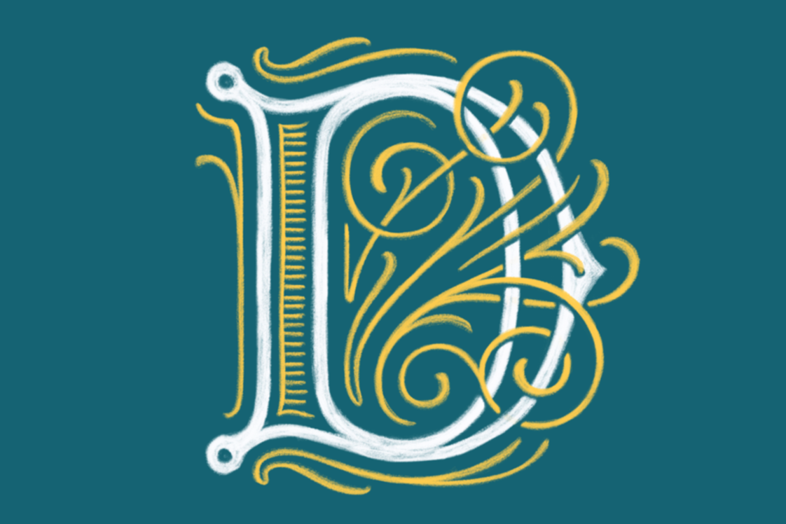
Some of my favorite things to draw are drop caps (so much, in fact, that I started a side-project dedicated to them!) The degree of possibility with the English alphabet (which includes the venerable ampersand, of course) excites and inspires me. Here are a few miscellaneous drop-cap-related pieces I've done in the past. Some of them answered a specific lettering challenge on social media, while others were done for the joy of lettering.
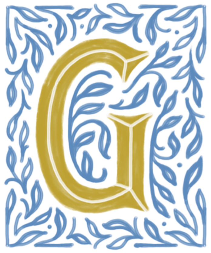
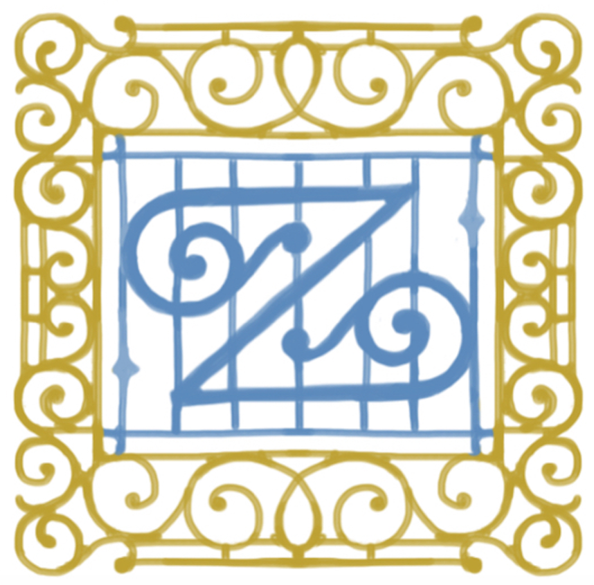
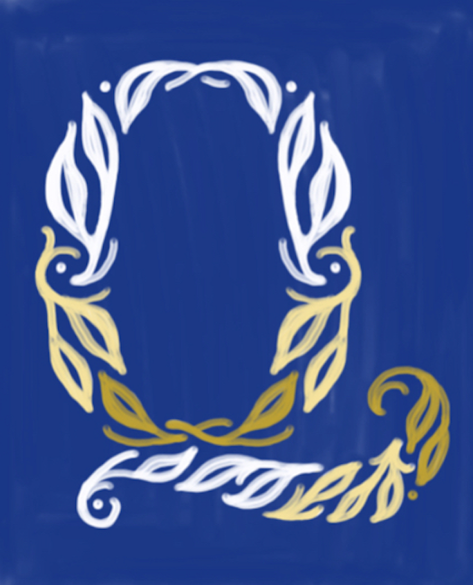
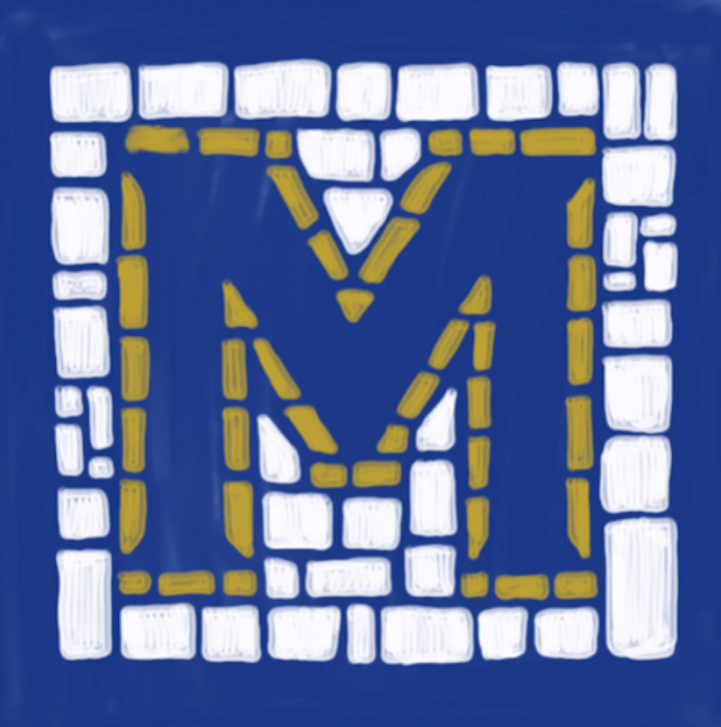
This piece features all 27 letters (of which I am staunchly asserting that ampersand is one). It answered a #Homwork challenge to create a piece with all of the letters of the alphabet. I'm a huge fan of cool colors + gold, so I was excited to create a cohesive piece through the use of those colors. Letterforms take inspiration from a lot of vintage art from the Wild West to wrought iron gates.
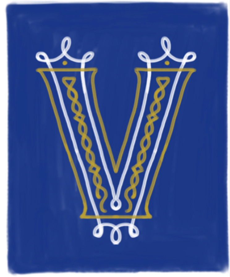
Here are some of my favorites:
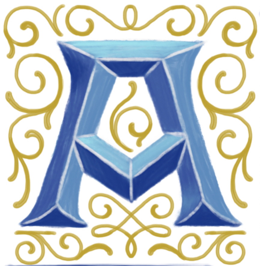
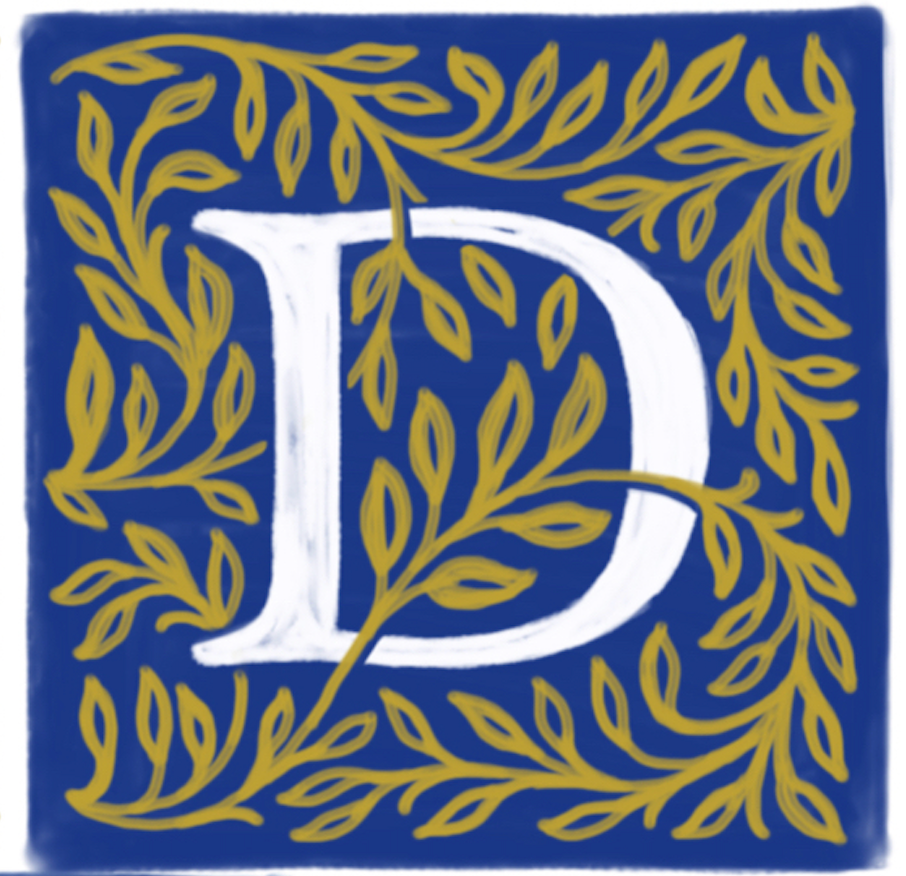




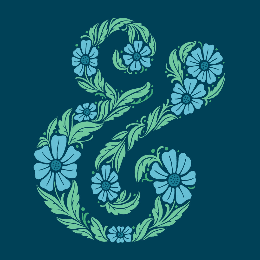
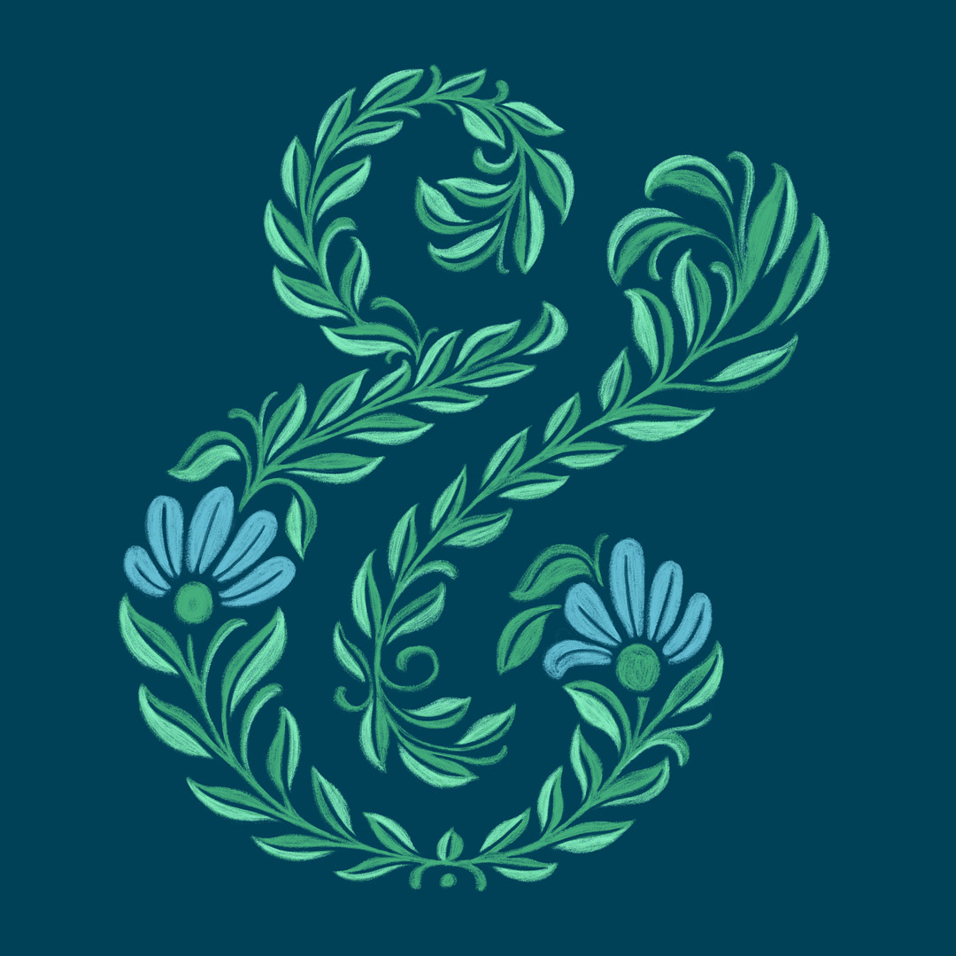
What typography enthusiast isn't a huge ampersand fan? Here are a couple of flowery, leafy ampersands just for the fun of it:
This series of drop cap Bs was in response to a challenge to draw 16 styles of one letter, but wasn't able to stop at only 16!
I enjoyed the B challenge so much that I decided to do a series of A's:
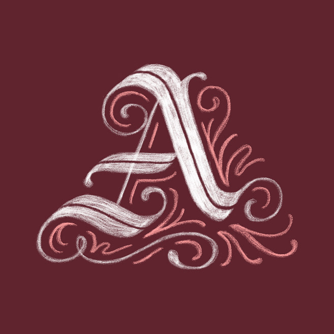
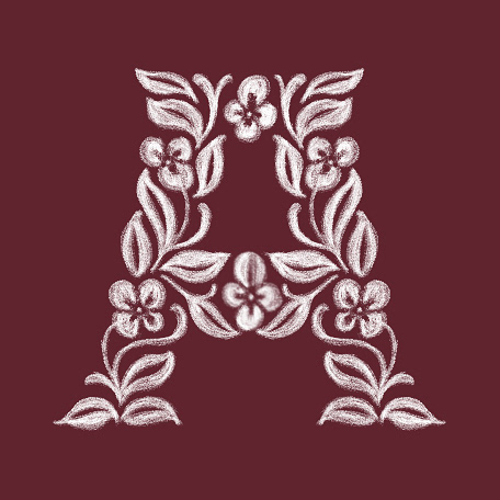
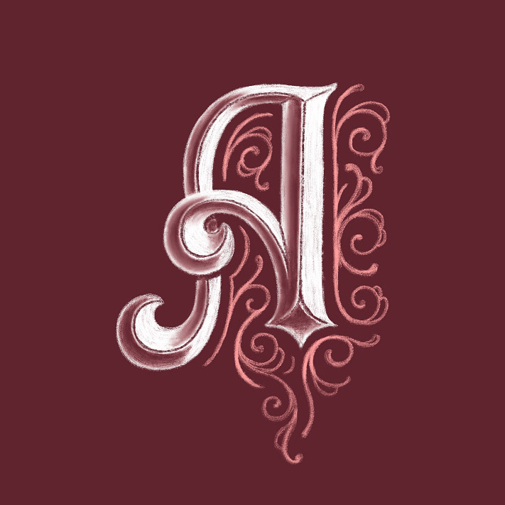
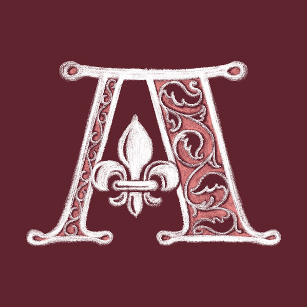
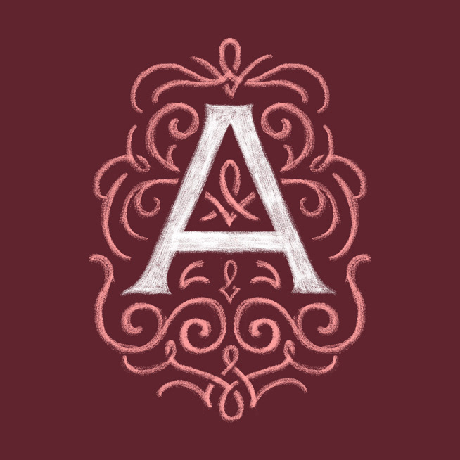
The A series was very satisfying to create and quite well-received, so I attempted a C series next, with a slightly more edgy color scheme. All three drop cap series created a lot of engagement on my Instagram feed, but the C series ended up getting the most of any of my work, ever (at the time).
Here are a few of my favorites, using a different color scheme:
