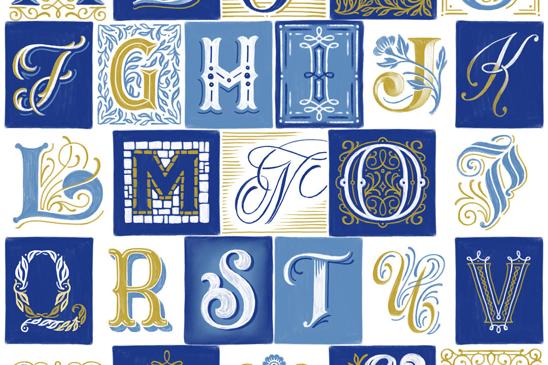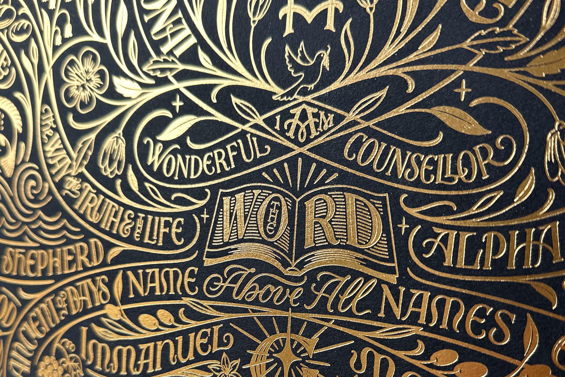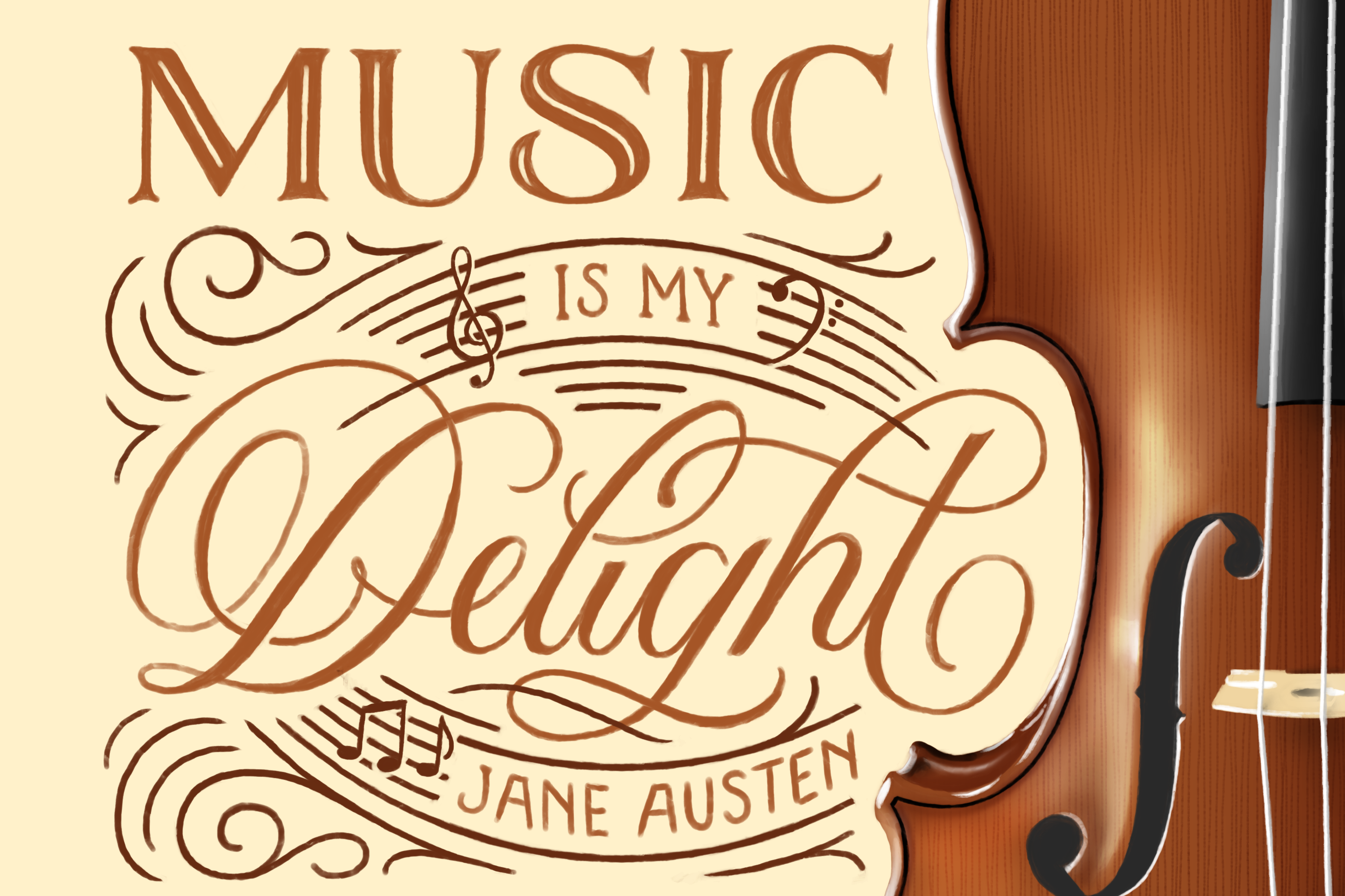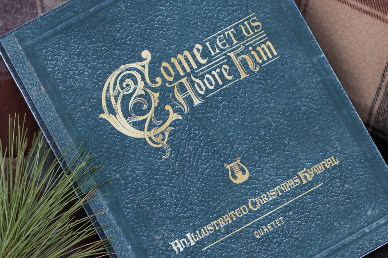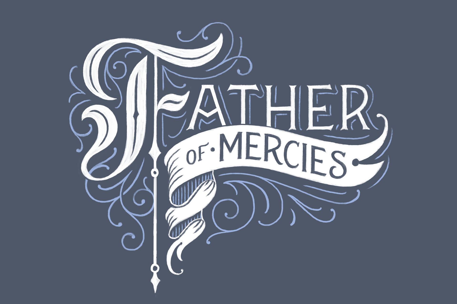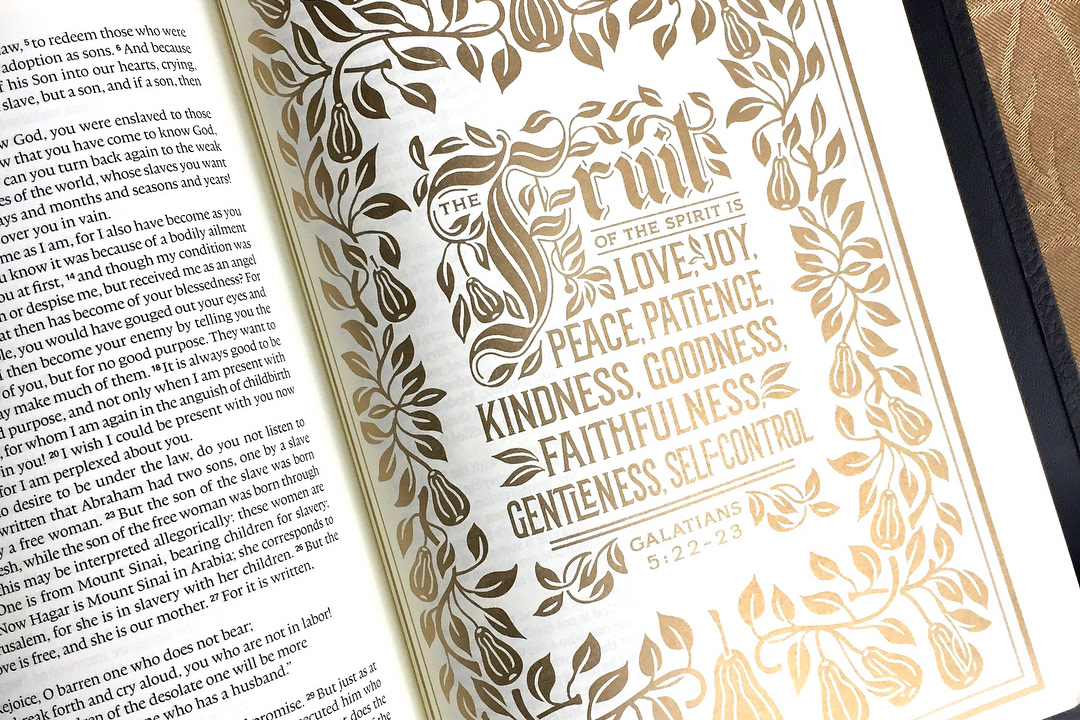
After a long, unsatisfying creative dry spell, I was considering how to break out of it when an Instagram hand-lettering challenge from Lauren Hom hit my inbox. I'd taken part in a few of the #Homwork challenges in past weeks- and especially enjoyed the letter-centric ones- but this one looked especially fun: It was a challenge to create a hand-lettered piece using every letter from the alphabet.
Creative dry spells are no fun. As an artistic person, there's almost nothing worse than wanting to create something, yet having neither the motivation nor the inspiration to do so. It's the "meh" feeling of wanting to make something... but not wanting to, either, all the while, wishing for That Fun Project to drop into my lap to start the inspiration and motivation flowing once again- That Awesome Project that makes me want to break out the iPad Right Now because there are too many ideas brewing, and they must all be conceptualized immediately.
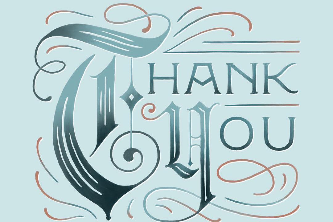
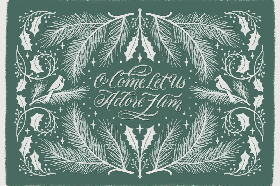
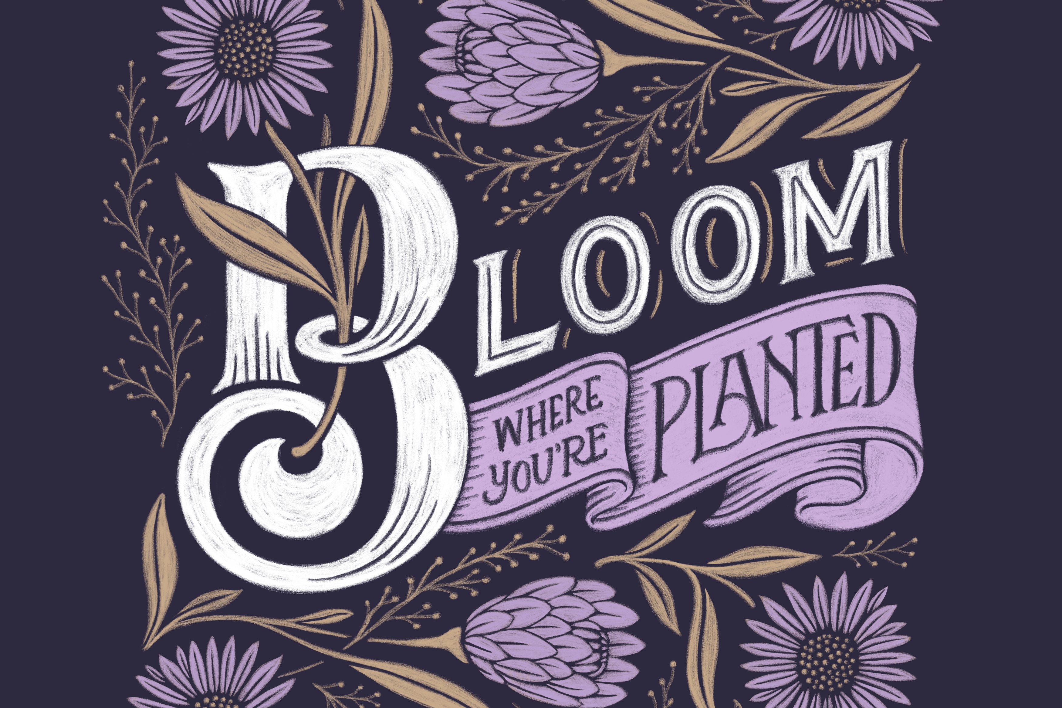
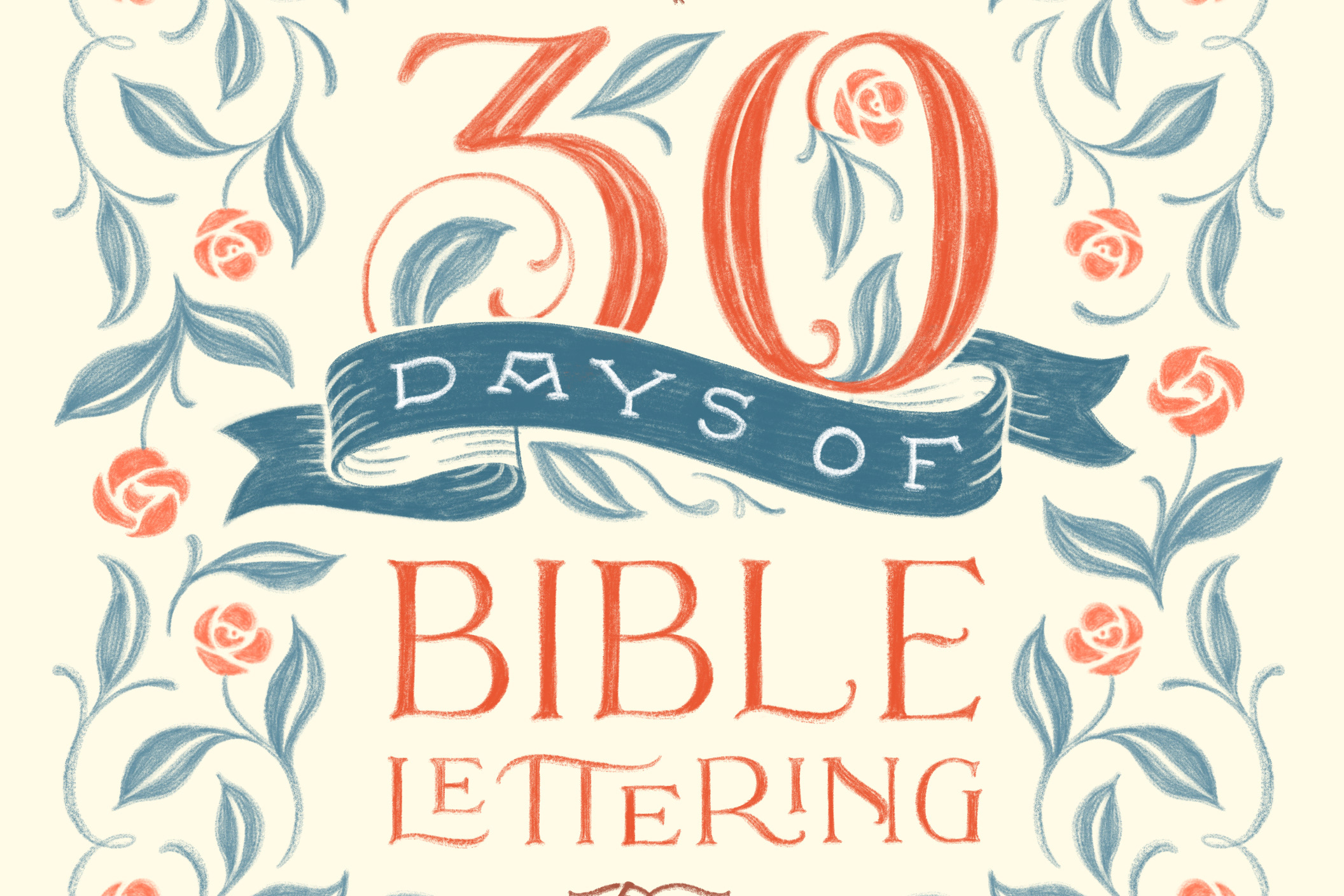
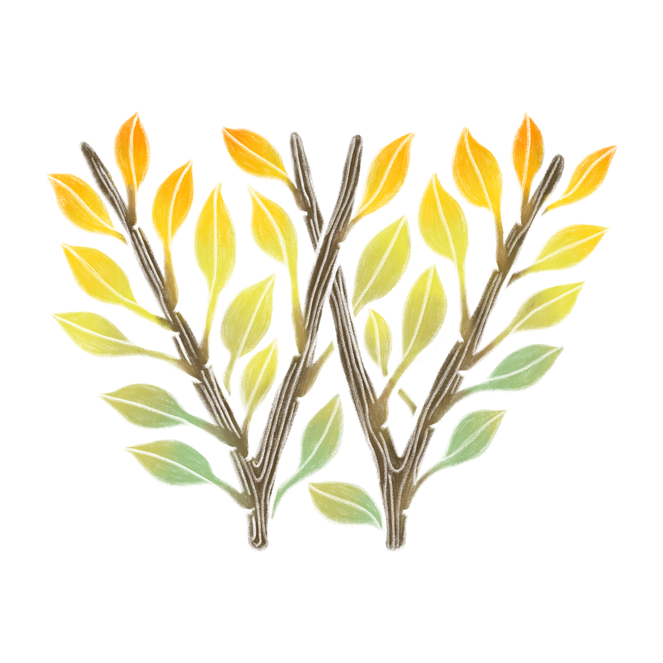
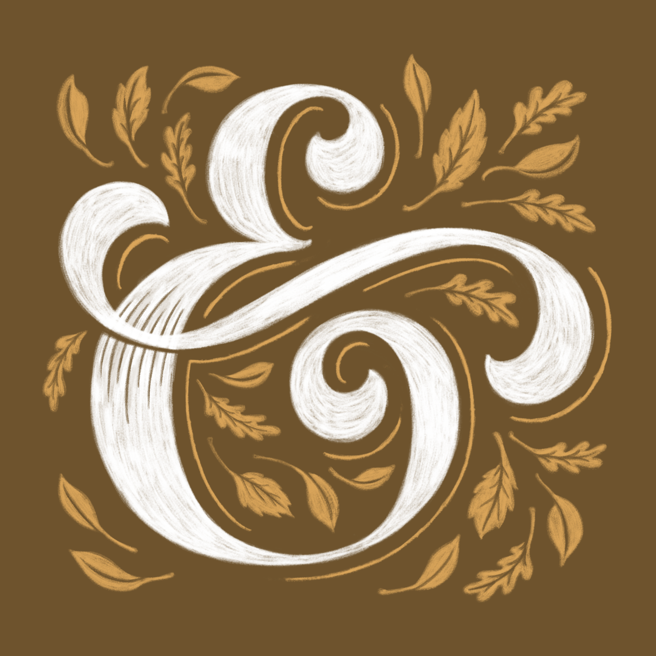
The challenge prompt that gave me the idea to start Drop Cap Study: "Create a design using every letter of the alphabet." Inspiration for this piece was drawn from many sources, eras, and styles. The main goal for this piece was to work the creative muscle and provide as much variation as possible. I used this Procreate brush set https://crmrkt.com/gpaO3r from Stefan Kunz to create the drop caps.
Drop Cap Study was hatched as a result. It was not only meant to be an exploration of letterforms and flourishes, but also it was intended to be a place for me to experiment with color (something I've always considered my creative weak point.)
Some of the time-lapse videos below show a little bit of the conceptualization and process.


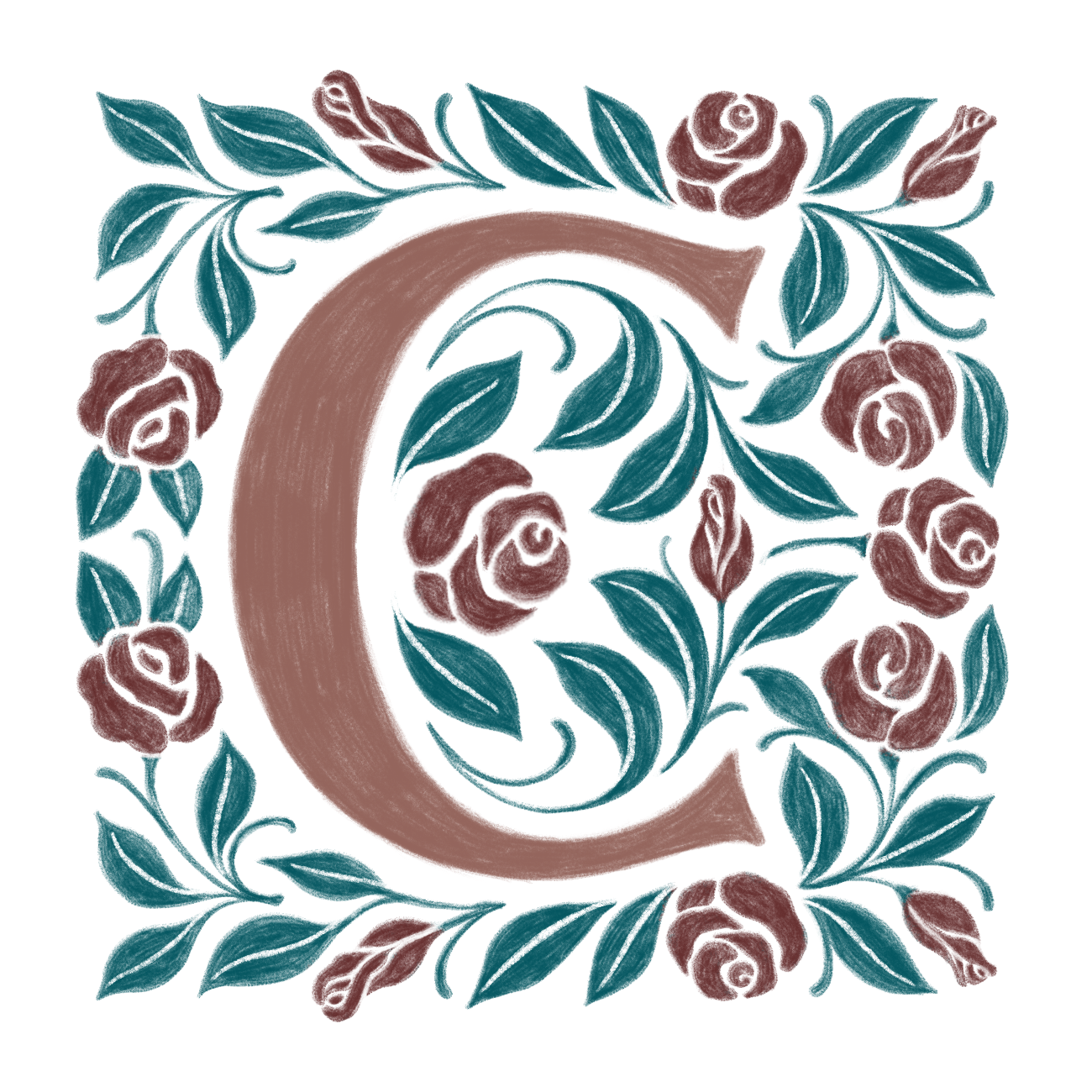
I also wanted to incorporate some form of seasonality- whether it was through color or illustration- into each drop cap design. This project draws inspiration from the color changes and variation that occurs when late summer changes into fall where I live. Ohio's September and October finds some trees totally green, while others are changing colors and losing their leaves.



Autumn has always been an incredible source of rich inspiration for me, so it’s been really challenging and fun to look outside as the season changes and incorporate early Autumn’s beauty into these drop caps. I’m really looking forward to keeping this up in future rounds as Fall turns into Winter.




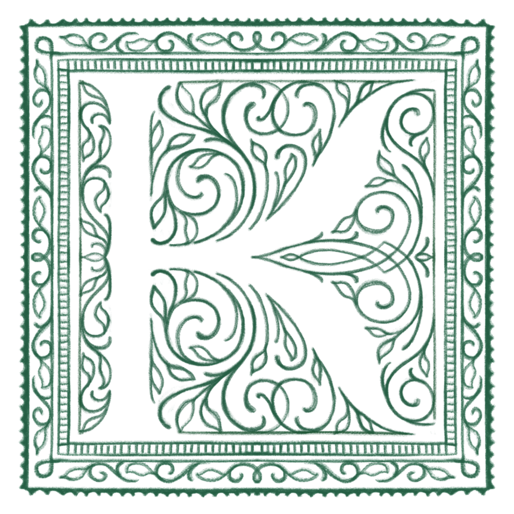

To read more about my process while creating these letters and other hand-lettered pieces, check out this recent interview on the Creative Market blog.

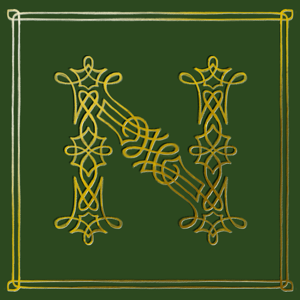


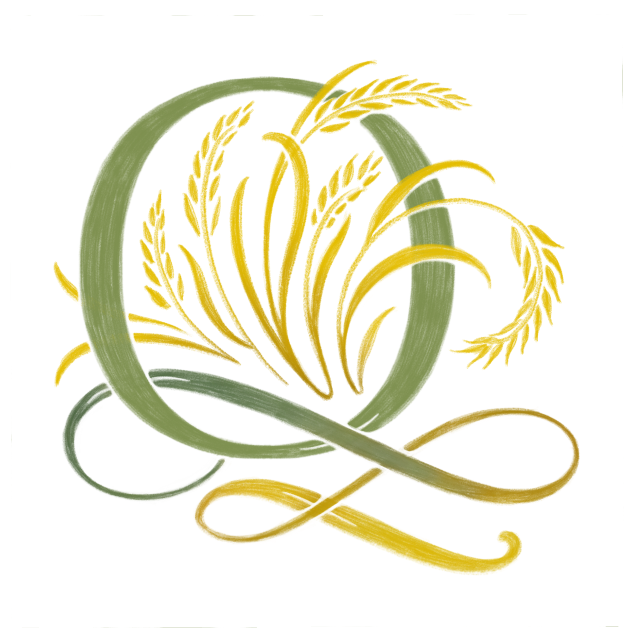

Each letter is created on iPad Pro using Procreate App. I cheerfully made use of the symmetry options for many of the drop cap designs. I really enjoy the mathematical aesthetic of symmetrical designs.
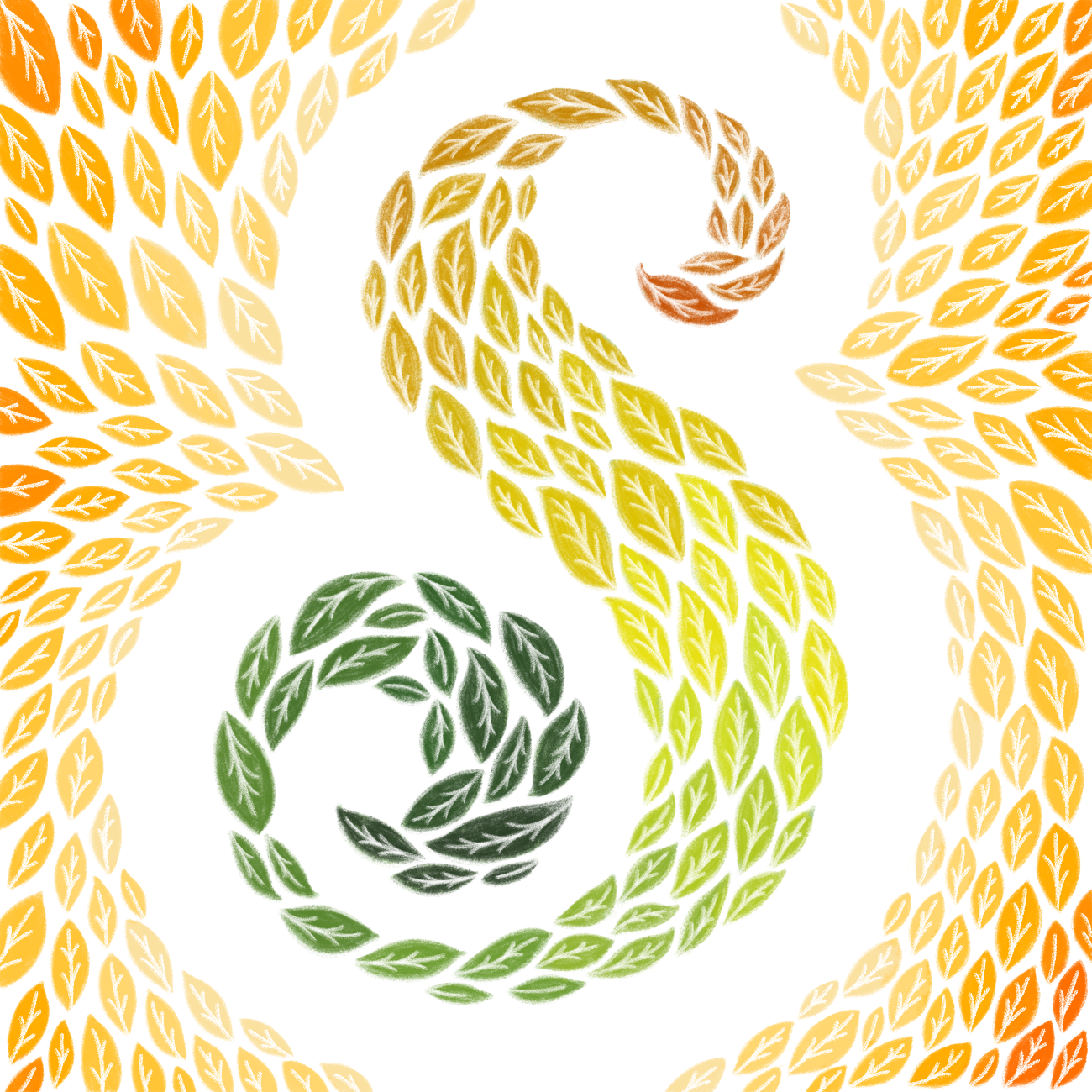


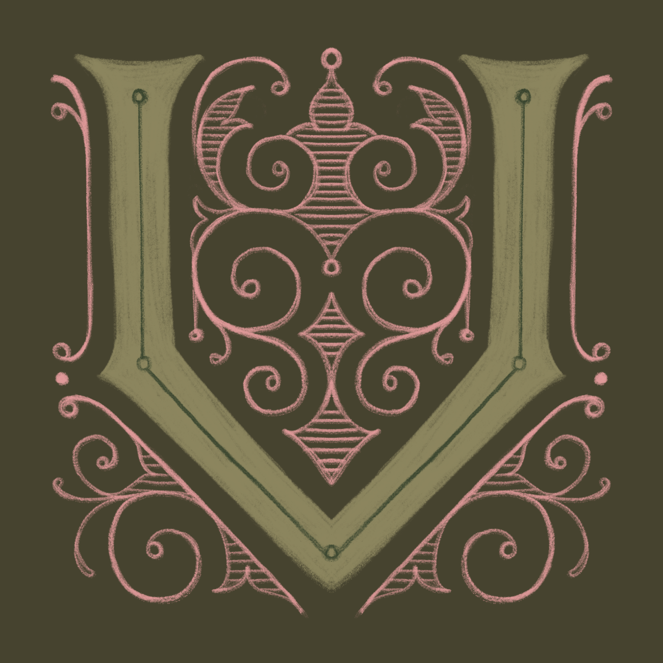



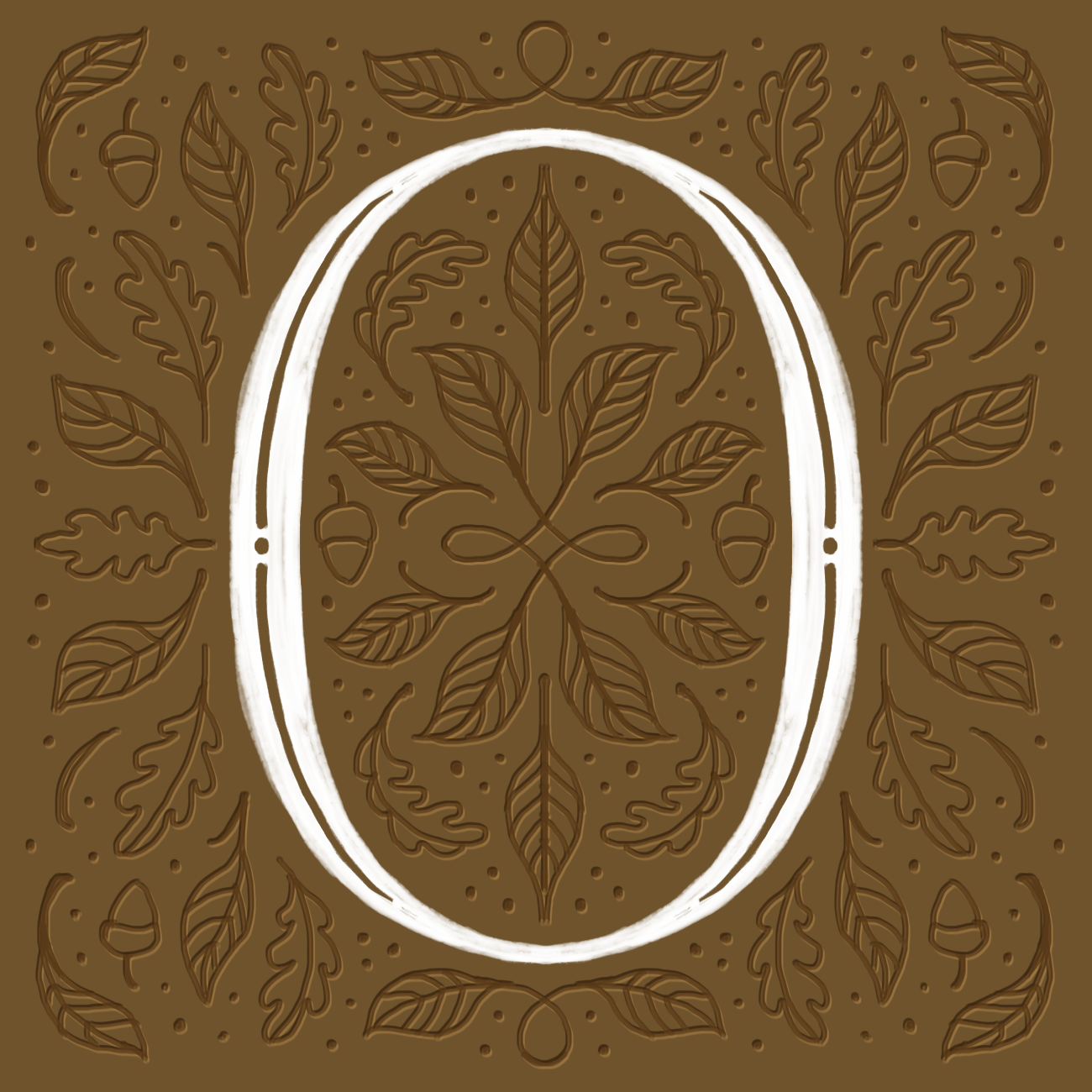
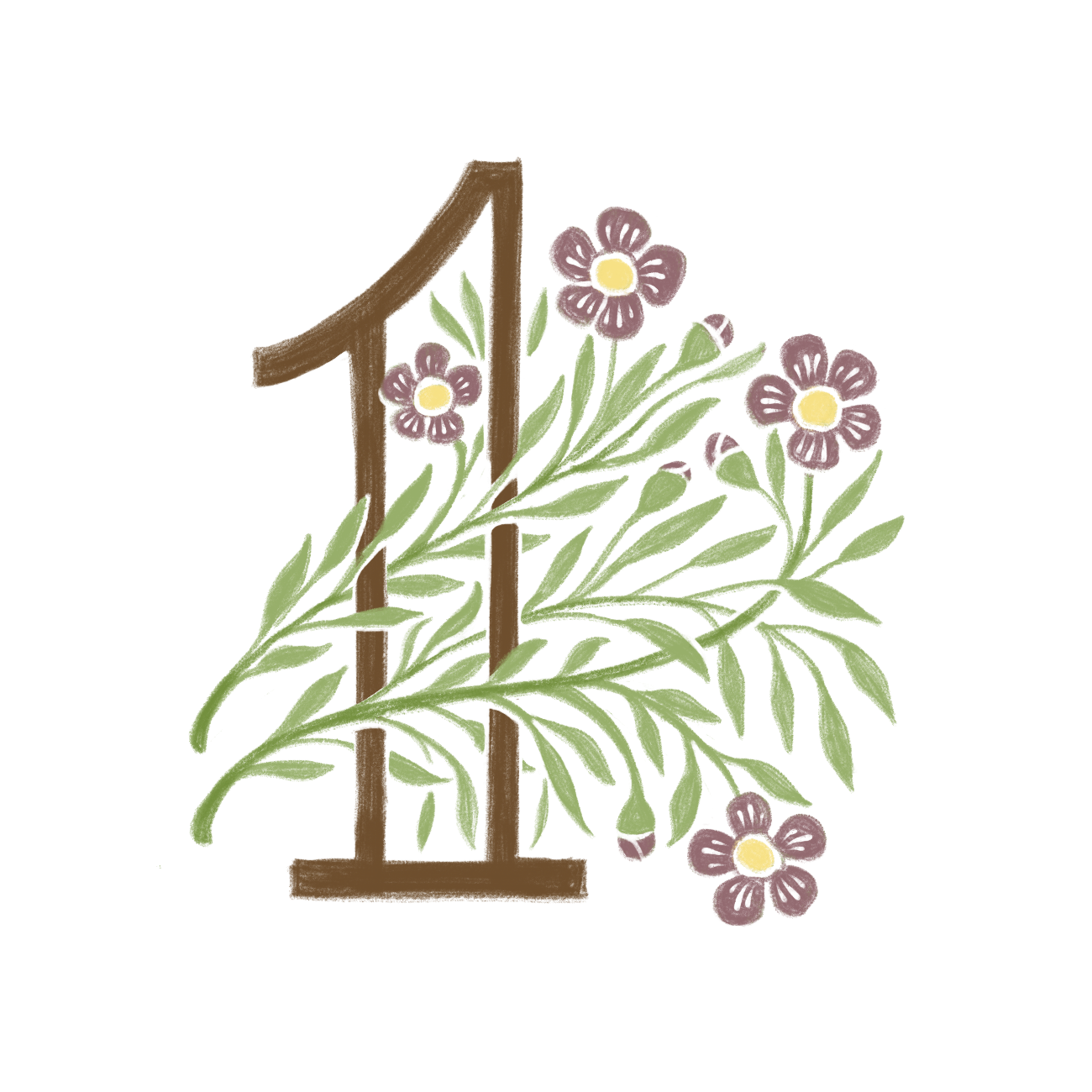
I didn't consider the series complete without numbers zero through nine, even though I knew these drop caps would be the most challenging (due to not having much practice with drawing decorative numbers.) It was a great exercise and a fun challenge, especially as I explored ways to incorporate new fall flowers and other harvest illustrations.

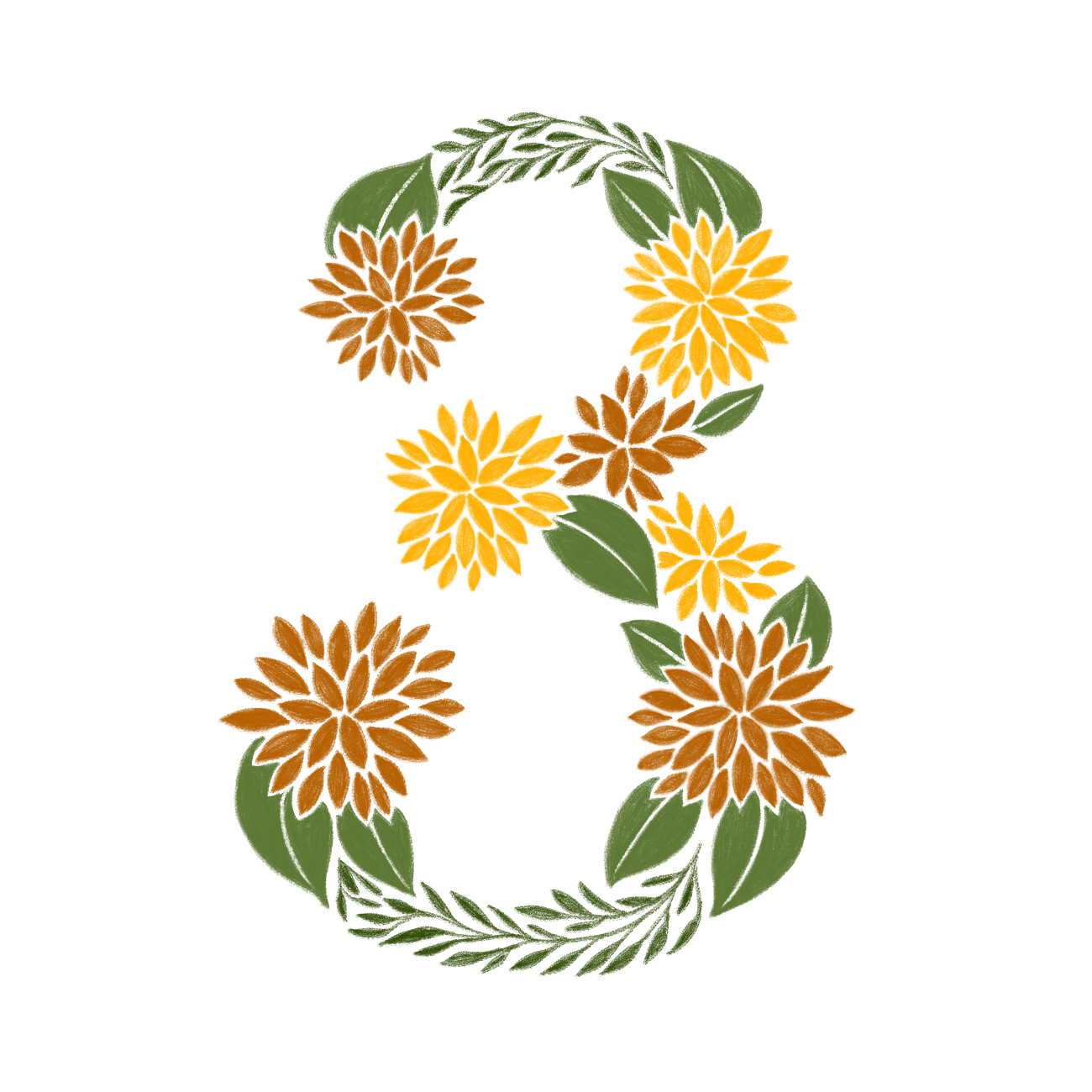



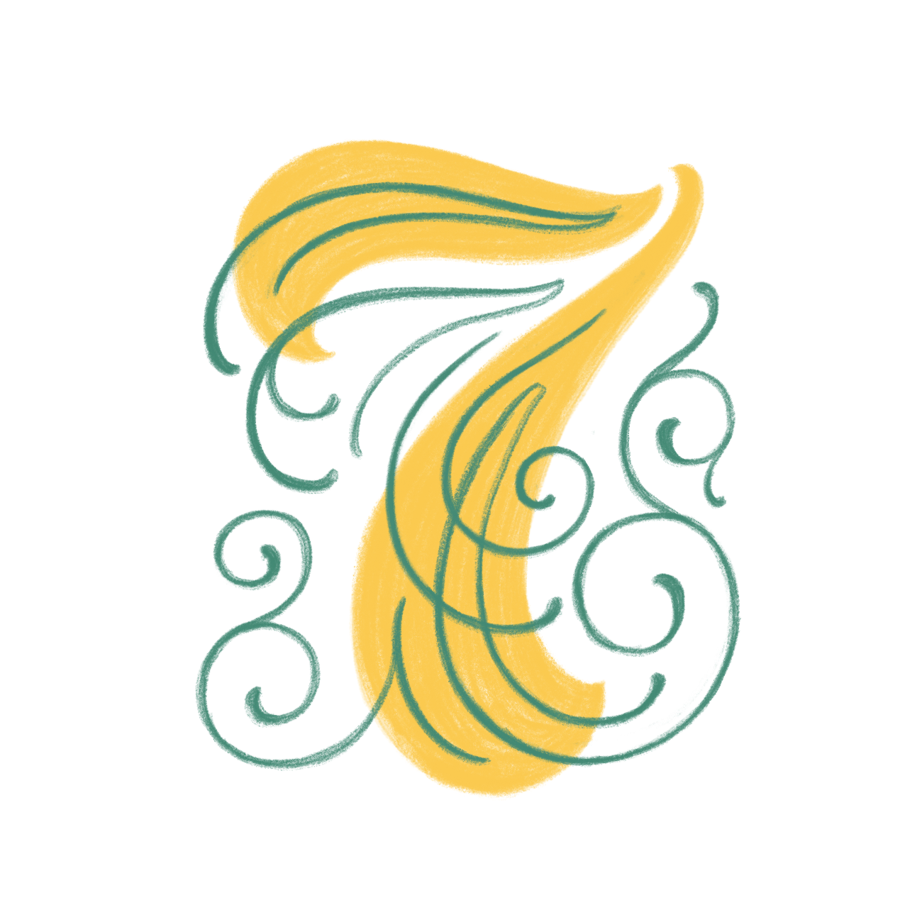
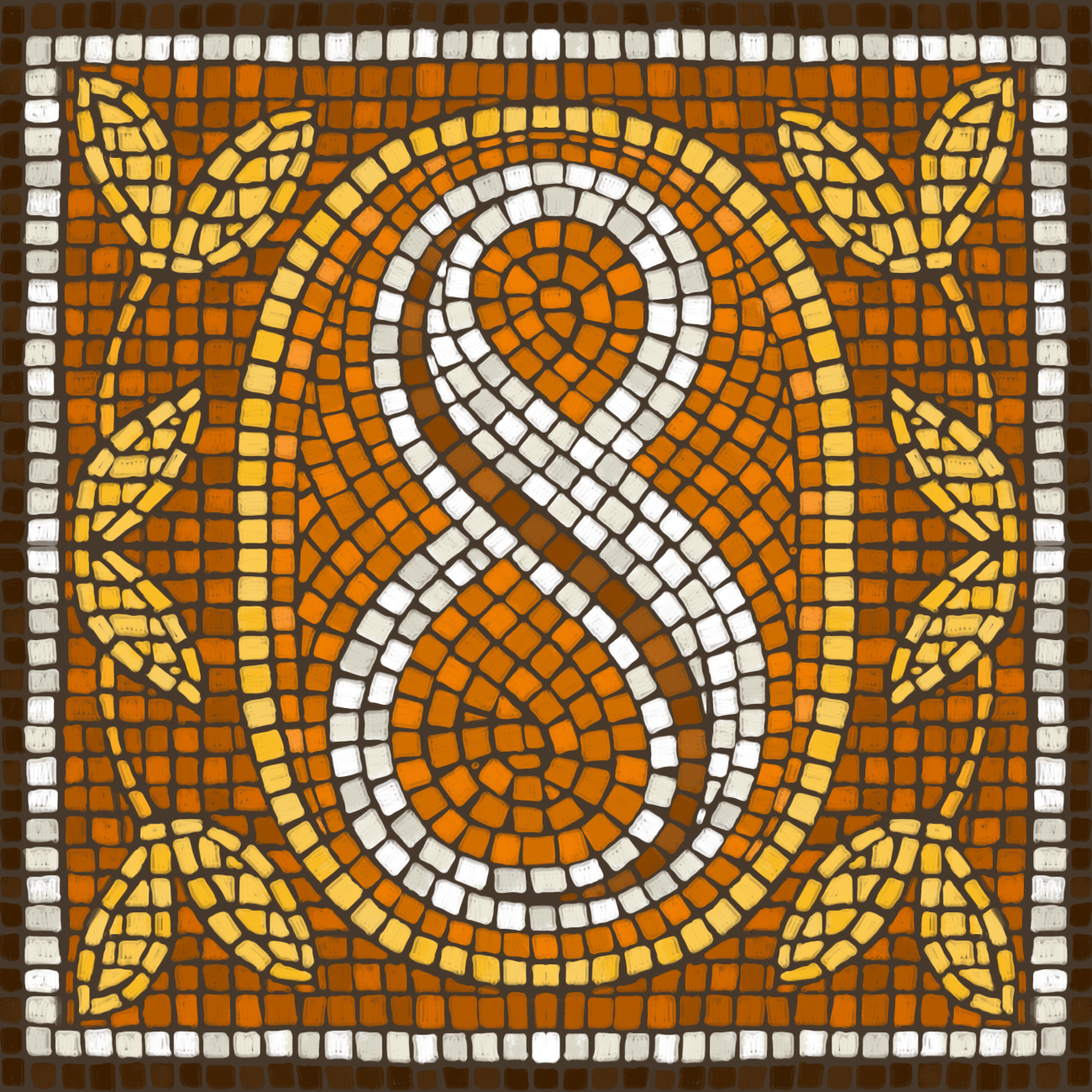
One of the most satisfying pieces to create in this series is the below "8" fauxsaic. Fauxsaics are largely uncharted territory for me, and I look forward to creating more.
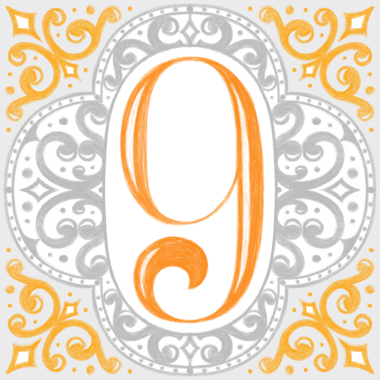
Thanks for checking out Drop Cap Study, round 1! If you're interested in following along for future rounds, follow me on Instagram on @Dropcapstudy.


